After years of crisp whites and showroom-perfect finishes, the mood is shifting. The Dulux Colour Forecast 2027 centres on connection and authenticity, homes that feel lived in, collected, and unmistakably yours.
Curated by the Dulux Colour Team, led by Colour and Design Manager Lauren Treloar and Colour Marketing Lead Lilybet Holt, the forecast responds to a growing sense that life has become fast, digital and a little repetitive. In Dulux’s view, colour is one of the simplest ways to make a home feel more human again.
The result is three palettes, each with a distinct personality – and one common thread. Blue runs through all three, quietly emerging as the new neutral.
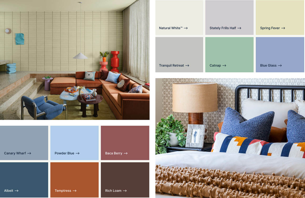
Play palette – soft pastels with bright berry and orange accents bring a joyful, optimistic energy to kids’ rooms, creative spaces and social areas.
Play: joy in the imperfect
Dulux Play pairs light pastels with bright, unexpected accents. Spring Fever (a soft yellow-green), Catnap (spearmint), Stately Frills Half (muted lilac) and Powder Blue set an easy, optimistic base, while Temptress (zesty orange) and Baca Berry bring the energy. Albeit, a softened navy, and Rich Loam, a brown with blue undertones, keep it grounded.
Dulux says the palette “celebrates individuality and self-expression”, championing “the joyful unpredictability of design and life” with playful colour, adaptable materials and a love of imperfection.
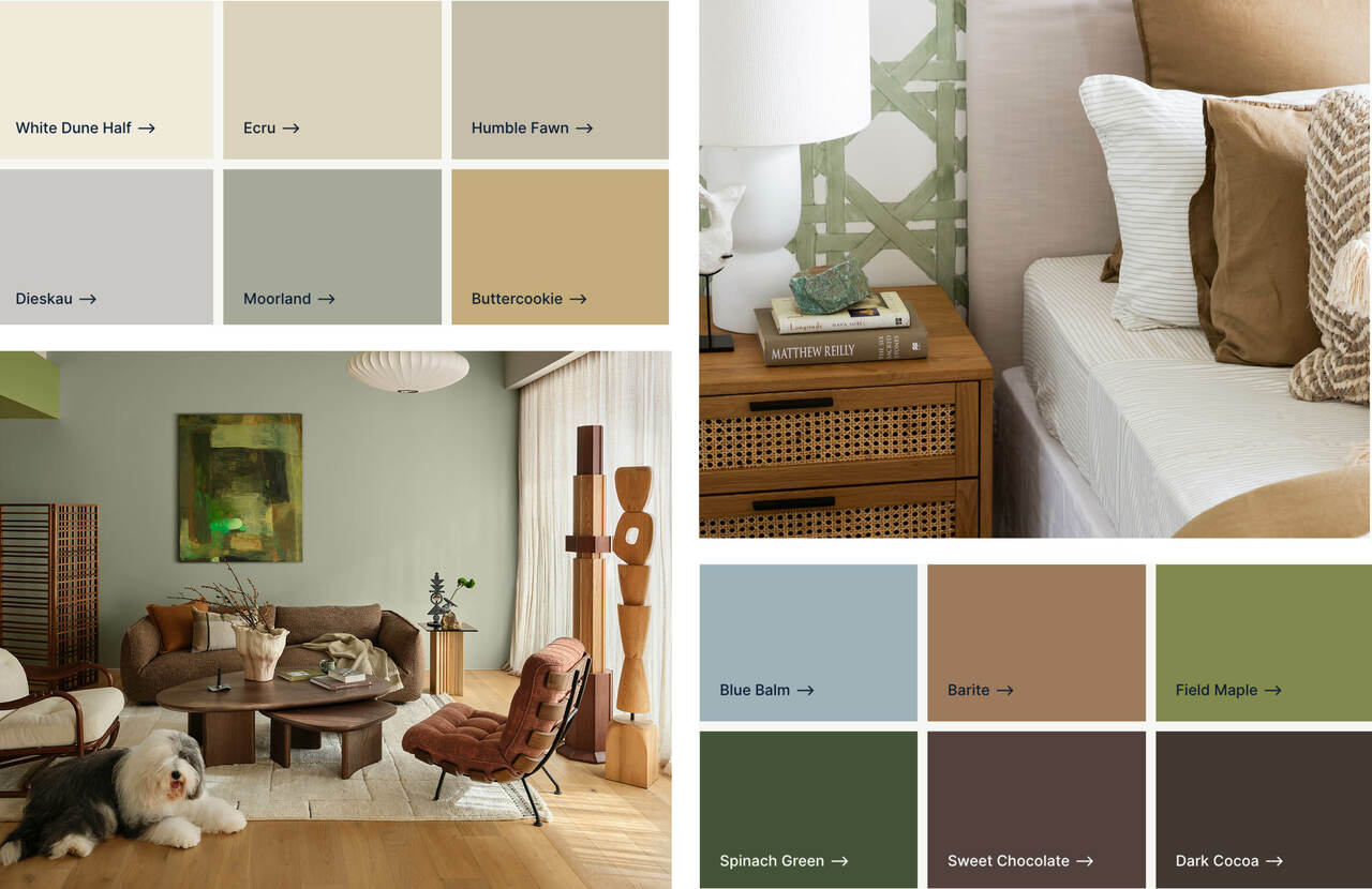
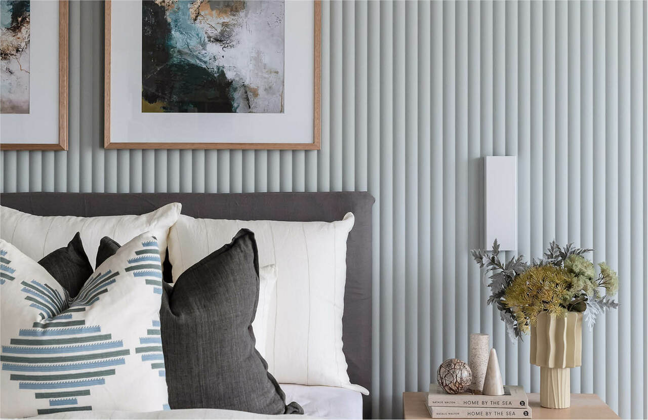
Sensory palette – layered greens, warm neutrals and near-black browns, with a gentle blue-grey, create calm, grounded spaces inspired by Japanese craftsmanship.
Sensory: comfort in stillness
Dulux Sensory draws on Japanese craftsmanship and everyday rituals. Layered greens Field Maple, Moorland and Spinach Green meet warm neutrals Buttercookie, Humble Fawn and Ecru, with near-black browns Sweet Chocolate and Dark Cocoa adding depth. Blue Balm, a gentle blue-grey, brings the calm.
Dulux describes it as “a celebration of calm, comfort and mindful living” that “offers a sense of calm in an increasingly connected world” – a space to slow down in.
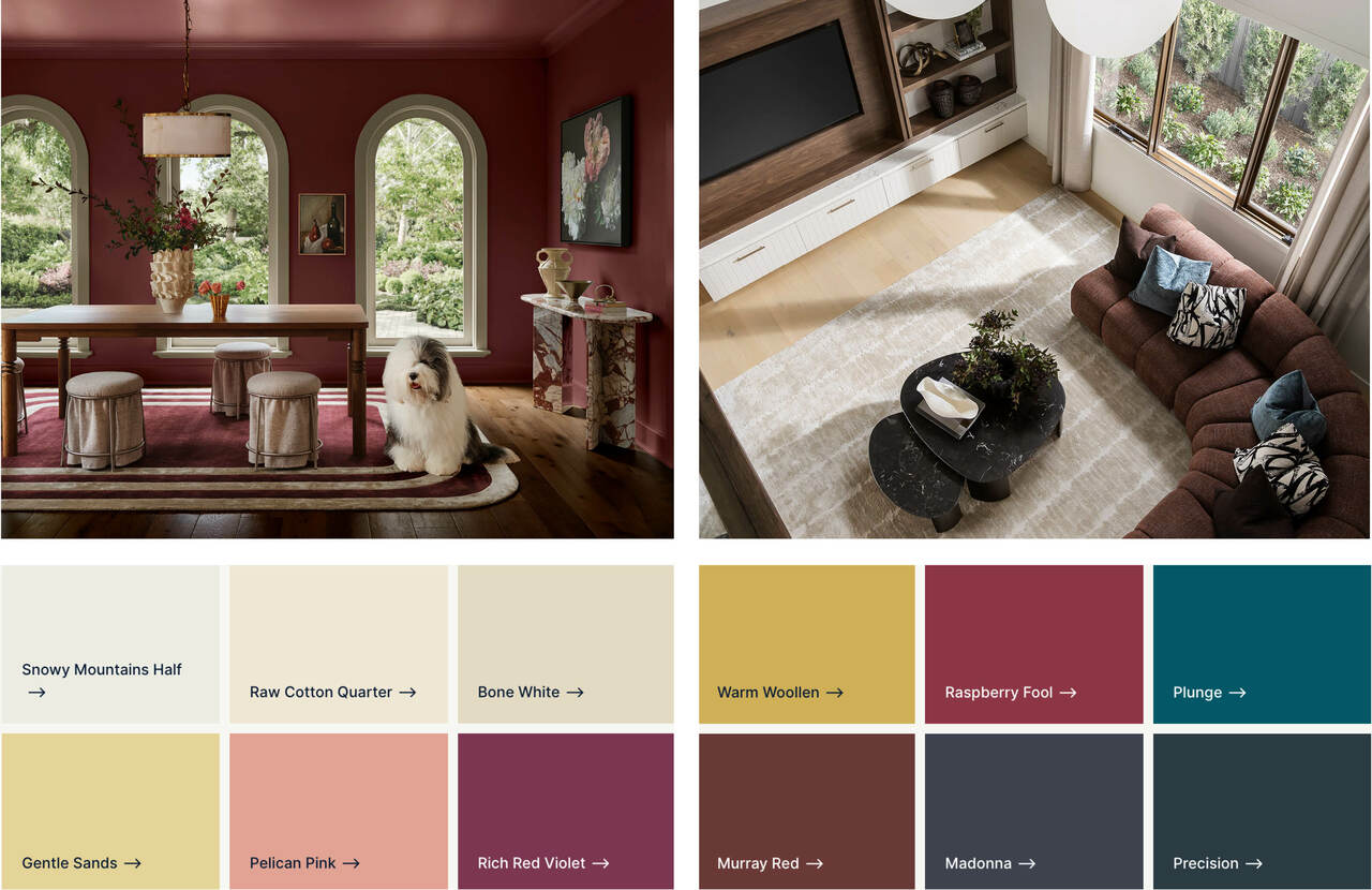
Treasure palette – jewel tones of raspberry, berry and deep blue, balanced by soft golden neutrals, for interiors that feel rich, layered and collected.
Treasure: restrained maximalism
Dulux Treasure is the dramatic one. Jewel tones like Raspberry Fool, Rich Red Violet and Murray Red sit alongside deep blues Madonna and Precision, the teal-leaning Plunge, and a warming coral in Pelican Pink. Soft golden neutrals – Gentle Sands and Warm Woollen – stop it tipping into too much.
Dulux calls it “an expression of storytelling and heritage” – a palette drawn from well-loved homes, personal stories and treasured objects collected over time. Style it with marble, high-gloss finishes, mixed metals and rich timber.
How to bring it home
You don’t need to pick up a paintbrush to make the forecast work for you. Think of the 2027 palettes as a mood rather than a paint chart – colour you can layer in through the things you already live with.
Start small. A throw, a stack of cushions or a new rug is the easiest way to try a palette – and the easiest to change when the mood shifts.
Let loose furniture do the work. An accent chair, side table, or ottoman in a forecast shade adds personality without committing to an entire wall.
Style with objects. Vases, ceramics, books, artwork, and lamp bases are the finishing layer, group a few from one palette for a collected, considered look.
Use the 60:30:10 rule. Let your interior scheme be the 60, furniture and soft furnishings the 30, and accent colours the 10 that pull it all together.
Refresh your home with the 2027 Dulux Forecast, one feature wall, cushion, or keepsake at a time.
Each palette also has a natural home within Carlisle’s interior schemes:
Sensory with Organic Escape and Autumnal Ambience. Layer a Field Maple linen throw, Buttercookie cushions and chocolate-toned ceramics against warm timber and natural finishes.
Play with Coastal and Laid-back Contemporary. Bring in a spearmint occasional chair, a lilac or powder-blue throw, and a single Temptress-orange vase or print for a hit of energy.
Treasure with Luxe Noir. Deep, moody finishes are the perfect backdrop for Raspberry Fool velvet cushions, a marble side table, brass accents and a teal or berry statement piece.
The takeaway for 2027
Whether it’s a Baca Berry cushion, a Raspberry Fool velvet chair or a Field Maple linen throw, 2027 is about choosing colour for how it makes you feel – not how it photographs. Start with the pieces you love, and let your home tell your story.
Ready to find your palette? Visit a Carlisle display home and see how colour, finishes and fixtures come together in person.
Images: Dulux Colour Forecast 2027. Photography by Lisa Cohen, styling by Bree Banfield.