Colour Harmony: Create a Beautifully Coordinated Home
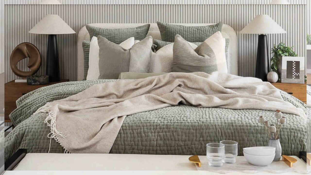
Too much of a good thing can throw an entire room off balance, especially when it comes to colour. While it’s tempting to fall hard for one hero hue, overusing it can leave a space feeling flat, themed, or overly coordinated in all the wrong ways.
The key to sophisticated interior design isn’t matching – it’s mastering the art of coordination. That means building a palette that feels cohesive but not predictable, confident but never chaotic.
In this guide, discover how to layer colour and materials with intention, through subtle contrasts, tonal variation, and carefully chosen accents, to create spaces that feel balanced, elevated, and uniquely yours.
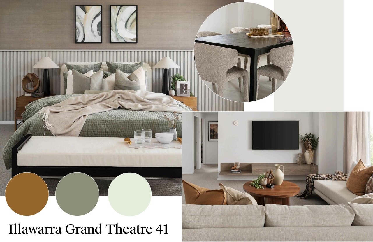
Coordinating colours adds depth and harmony to your home, while strict matching can make spaces feel flat.
- Coordinating vs Matching: What’s the difference?
Simply put, colour matching is where you’ll use the same colour repeatedly – cushions, vases, throws, even the dog bed. It’s a simple trap that can make a space feel one-dimensional.
Coordinating, on the other hand, is where the magic happens. Choosing colours that work together – not necessarily identical, but harmonious in tone, hue or intensity.
“Not every item needs to be the same colour to tie back to the overall ‘look’,” says Carlisle Homes Interior Designer Manager, Jess Hodges. “In fact, using too much of one colour can flatten the effect. Leave breathing room for neutrals, mix up your tones, and the result will feel far more considered.”
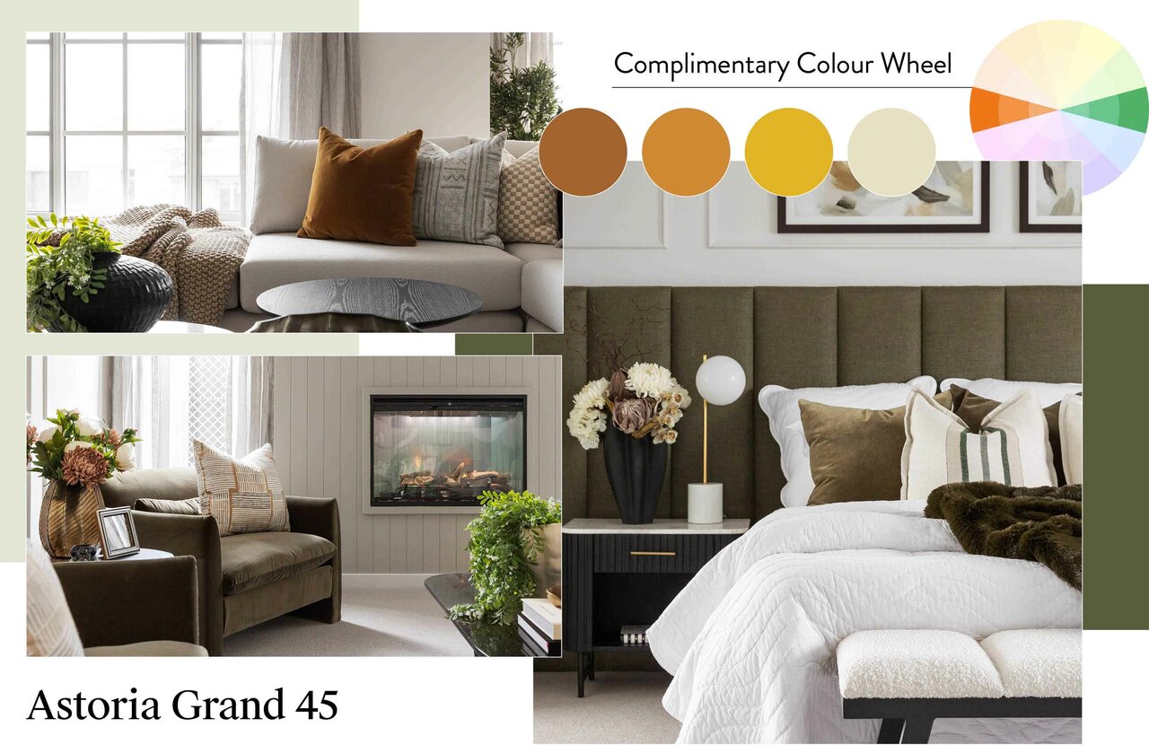
Using the colour wheel helps create a balanced, layered palette for a home that feels intentional and cohesive.
- Use colour theory to strike the right balance
If you’ve ever walked into a room and thought “this just works”, there’s a good chance colour theory played a role. Understanding how colours interact on the wheel is one of the simplest ways to create a palette that feels intentional, layered, and visually satisfying.
To avoid that cookie-cutter feel while still tying a space together, Jess recommends these four foolproof approaches:
- Complementary: Pair colours from opposite sides of the wheel (e.g. deep green with burgundy) for striking contrast that still feels balanced.
- Split Complementary: Take one base colour (like green) and pair it with two neighbours of its complementary (e.g. burgundy and burnt orange) for a more layered and curated look.
- Monochromatic: Use the same colour in varying shades, like pale to charcoal blue, for a gentle sense of harmony.
- Analogous: Choose colours next to each other on the wheel (e.g. green, yellow-green, and yellow) for a soft, seamless transition between tones.
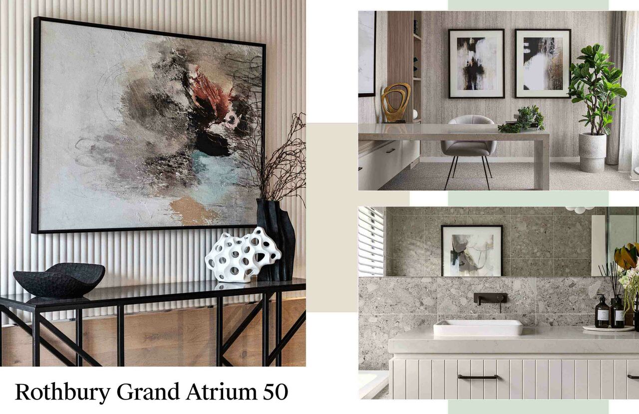
At Rothbury Grand Atrium 50, Carlisle’s ‘Light Meets Dark’ scheme pairs petrol blue, burgundy florals, and moody artwork for bold yet cohesive contrast.
- Expert design in action
While the jargon is worth knowing, the best way to understand how colour theory works in real homes is to see it in action. Carlisle’s interior schemes offer perfect examples of how thoughtful colour choices can elevate a space without feeling overly styled or ‘matchy’.
At the Illawarra Grand Theatre 41 in Werribee’s Harpley Estate, the Autumnal Ambience scheme plays with rich, golden tones layered across furniture, artwork and soft furnishings to create a warm, welcoming palette. At the Rothbury Grand Atrium 50 in Peppercorn Hill Estate Donnybrook, the Light Meets Dark scheme makes a bold statement by pairing petrol blue with burgundy florals and moody artwork, proving that contrast can feel cohesive.
“In the Astoria Grand 45 at Cloverton Estate, Kalkallo, we nominated deep green as the hero colour, then paired it with taupes, tans, and burnt oranges,” says Jess. “It’s a great example of using a strong colour sparingly and strategically, without letting it overwhelm the space.”
- Materials matter too
Your materials set the tone, literally. Flooring, cabinetry and benchtops are your base layer, so consider how they support the rest of your palette.
“A neutral base gives you the flexibility to layer colour in more intentional ways,” says Jess. “But you can also start with a feature. For example, we used Laminex ‘Possum’ cabinetry in the Provincial Grand Pantry 29 at Peppercorn Hill Estate, then added terracotta and burnt orange decor to complement the tone. If we’d used only green, it would have felt flat.”
For stone surfaces, try echoing warm undertones – like creams, soft browns or rusts – in nearby furnishings and soft decor for subtle continuity.
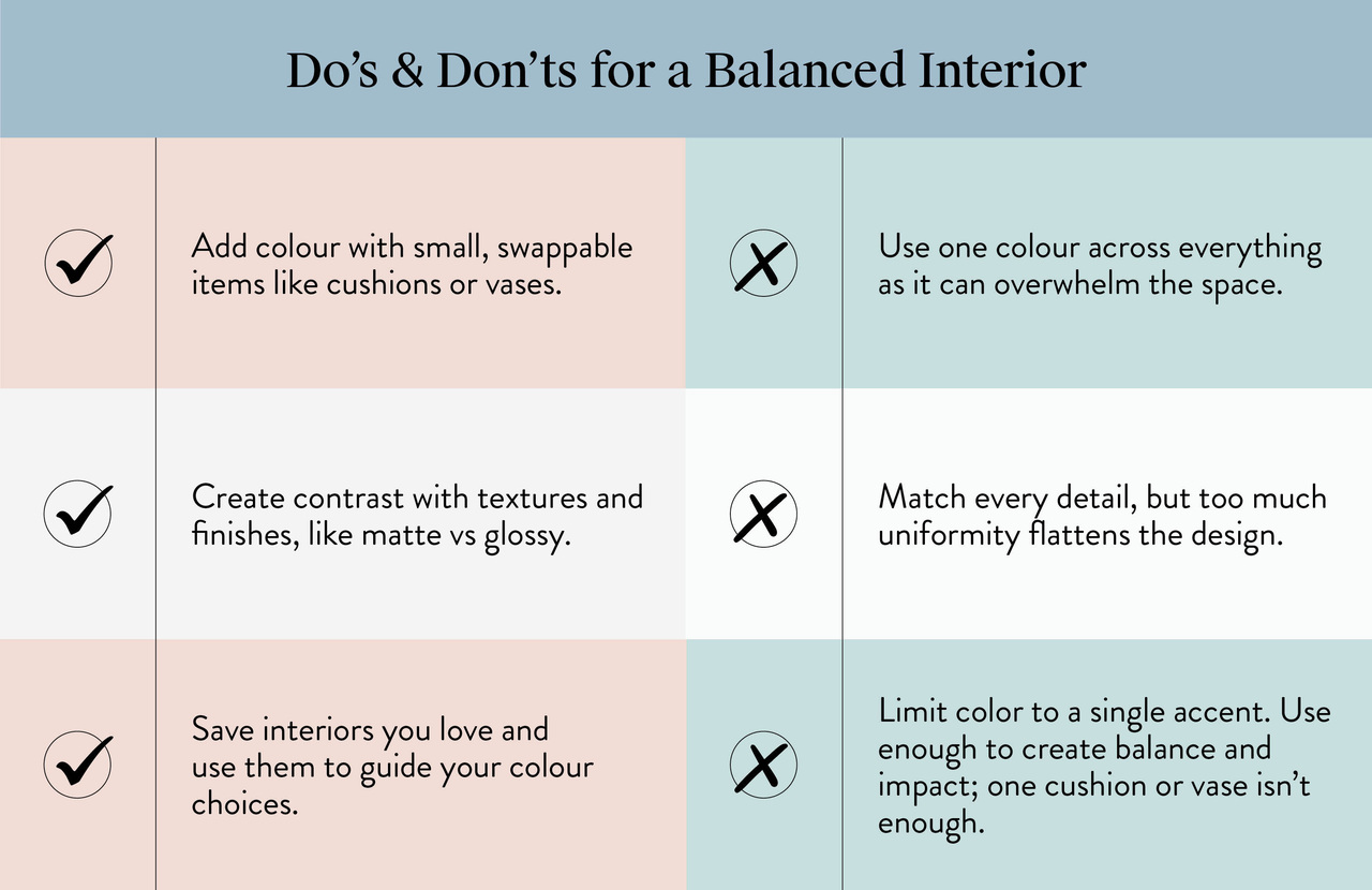
Decorating do’s and don’ts: Use colour in small pieces, mix textures, and avoid matching every detail for a stylish, layered home.
- Decorating do’s and don’ts
Once you’ve chosen your palette, how you apply it is just as important. These dos and don’ts from Jess will help you strike the right balance between stylish and overstyled.
Do:
- Use colour in smaller, swappable pieces like artwork, cushions, vases, and even lamps. It’s far easier (and cheaper) to switch up a vase than a full-size sofa.
- Build in contrast through texture and tone, think matte ceramics against glossy surfaces, or boucle next to timber.
- Keep a folder of interiors you love and study them closely. Which colours are repeated? What’s left neutral? Let these reference points guide you.
Don’t:
- Go all-in on one colour across every surface. A navy feature wall, a navy couch, and a navy rug can quickly feel like you’re drowning in a sea of blue.
- Try to match every detail to your scheme. A little variation keeps the space interesting and layered. It’s the mix, not the match, that makes a space sing.
- Limit colour to just a token accent. One cushion or a single vase won’t carry the scheme—use enough to create balance and impact.
Bring colour harmony to life in your own home. Visit Carlisle Homes’ display homes to see how expertly layered palettes and interiors create spaces that are stylish, balanced, and ready to inspire your next move.
