Embrace Your Zen With Dulux’s Gorgeous New Palette - Retreat
by Carlisle Homes
Artworks: Casey Freeman via Greenhouse Interiors. Photographer: Armelle Habib. Stylist: Julia Green.
Soothing, sophisticated and oh-so-versatile – Dulux’s Retreat colour palette hits all the right notes
Our homes are our havens in challenging times – somewhere to retreat, recharge and make sense of what’s going on in the world outside. And according to the colour experts at Dulux, the desire for security and comfort will be a driving force behind interior trends next year. The paint powerhouse recently released the Dulux Colour Forecast 2021 – a trio of curated palettes informed by global design trends – to give us a snapshot of the colours we’ll be seeing everywhere in the months ahead.
In the second of our three-part series, we explore Dulux’s Retreat palette, a calming collection of dusty and oceanic blues, brown-based neutrals, warm whites and burgundy.
The Retreat palette’s mix of stormy blue, soft grey and tranquil green are the perfect combination to stimulate inspiration and creativity. Image courtesy of Dulux® featuring ‘Caramel Sunday’ artwork by Georgie Wilson via Greenhouse Interiors. Photographer: Armelle Habib. Stylist: Julia Green.
“The Retreat palette feels tranquil and sentimental – reminiscing on traditions, while hinting at better times to come,” says Andrea Lucena-Orr, Dulux’s Colour and Communications Manager. “It speaks of renewal and growth. As work-life boundaries blur, we look to style our interiors to be hybrid and high-functioning; spaces are mindfully curated with versatile pieces in authentic designs and materials, and art and decoration that has personal meaning.”
Here’s how and where you can use these fashionable hues in your own home.
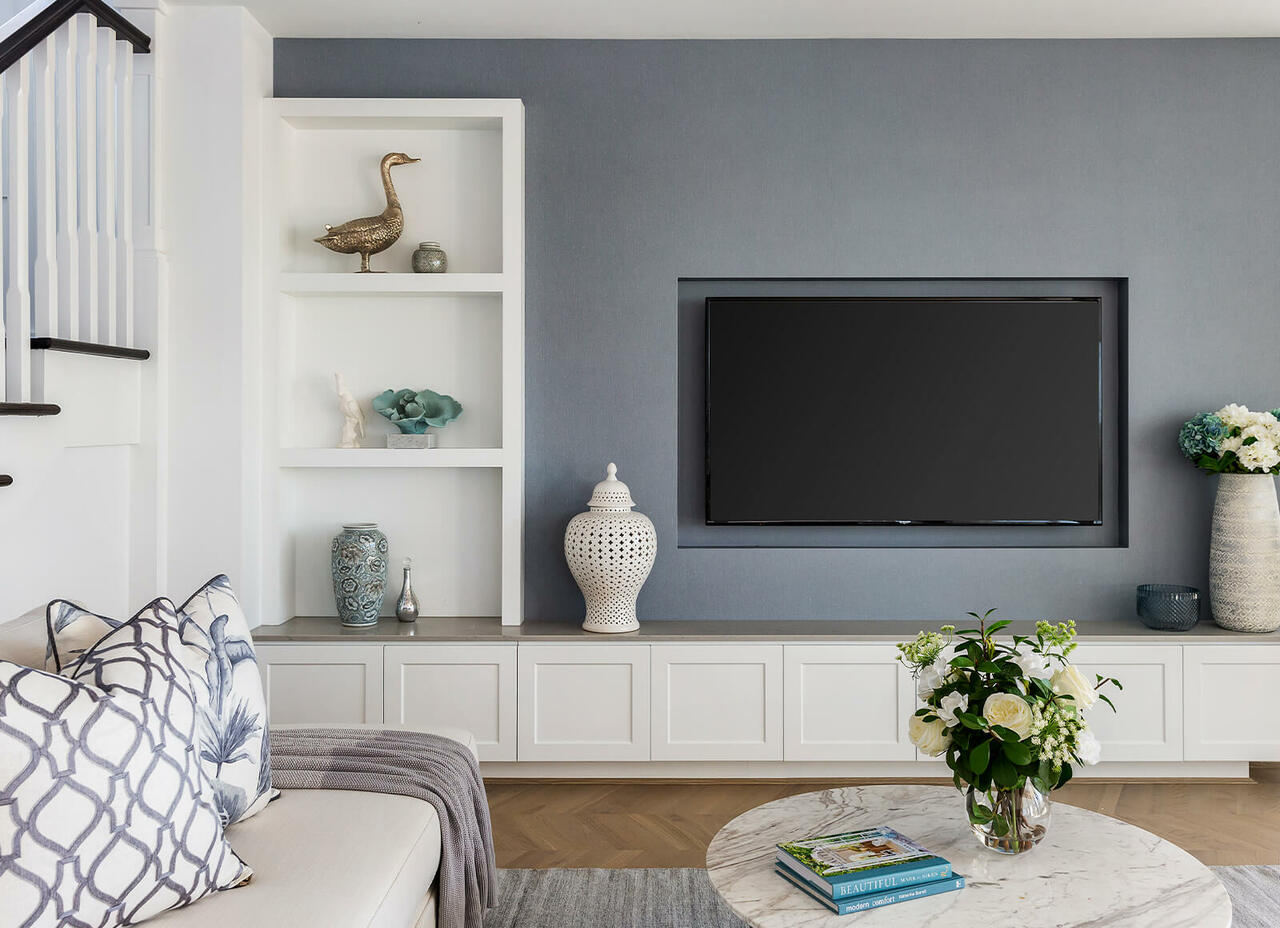
Opt for a calming aesthetic with the Retreat palette’s earth-based hues for ultimate rest and relaxation in the quiet rooms of the home. Image courtesy of Dulux® featuring ‘Sun Drenched’ artwork via Greenhouse Interiors. Photographer: Armelle Habib. Stylist: Julia Green.
Look to quiet, relaxing rooms
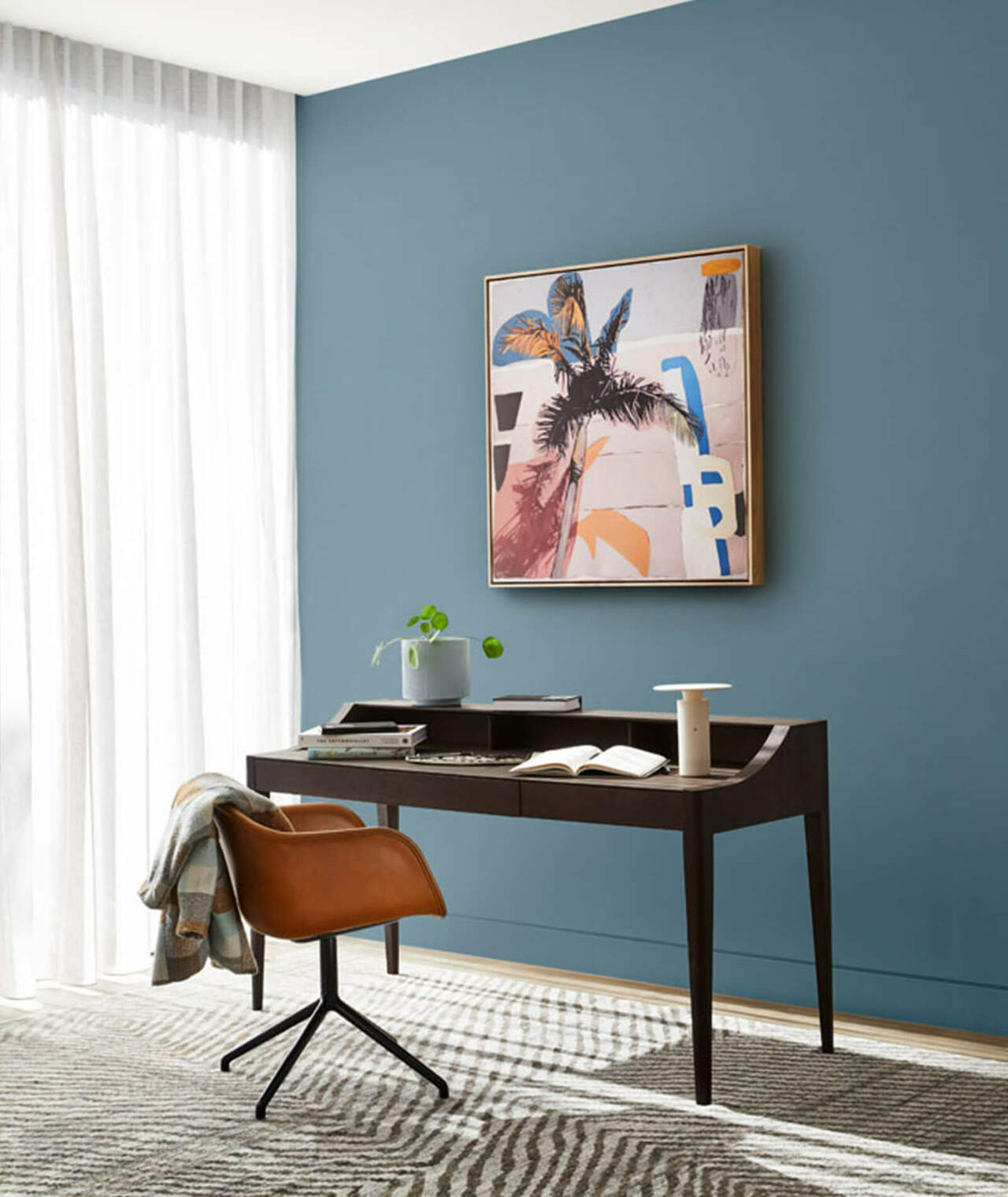
With its tranquil and cocooning vibe, the Retreat palette is perfect for styling those quiet spots in your home where you want to switch off, such as a bedroom, living room or dining room. Create a striking feature wall behind a bed or desk with a stormy blue such as Dulux Five Fingers Peninsula, balanced out with a lush, warm white such as Dulux Whisper White on the other walls and the ceiling. Or, give a dining room a contemporary lift by opting for warm grey for walls – Dulux Diffused Grey.
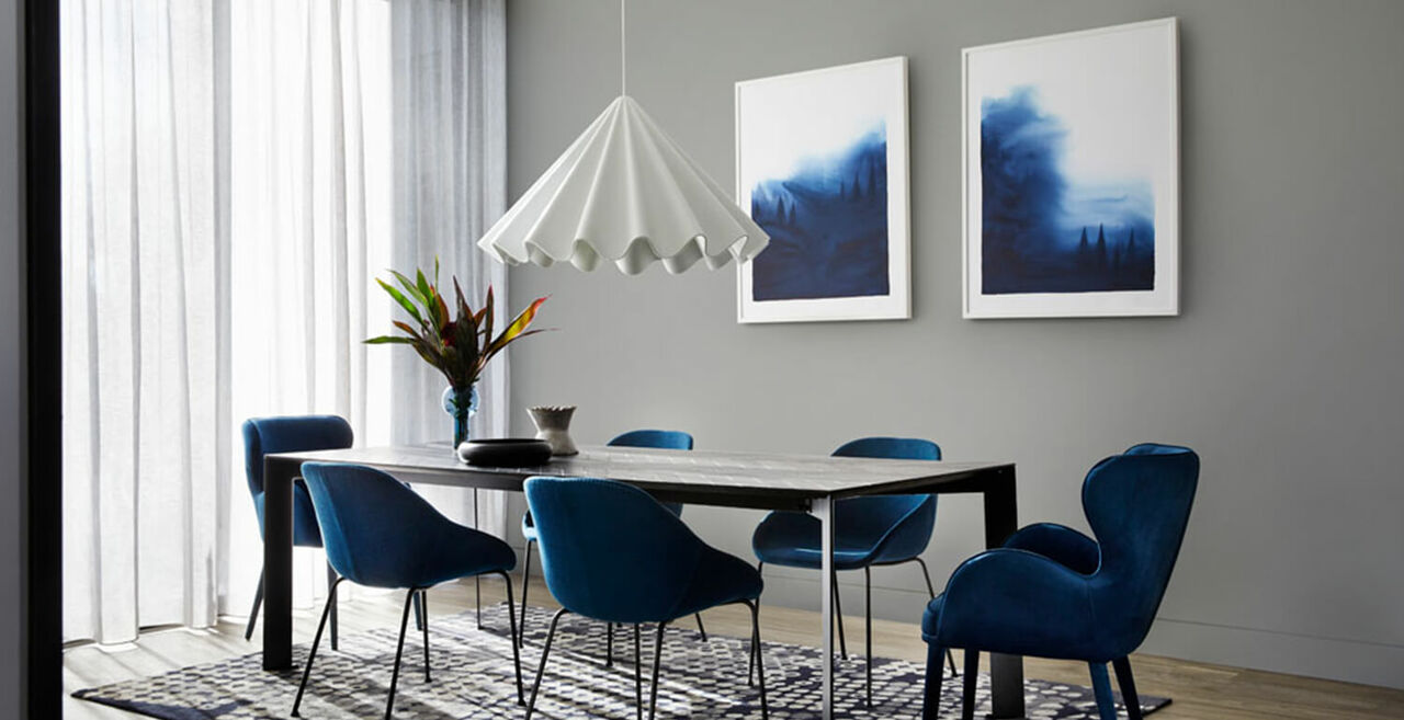
Incorporate a feature wall using the Retreat palette’s tranquil blues for a relaxing yet contemporary look, as shown here in Sorrento Grand Retreat.
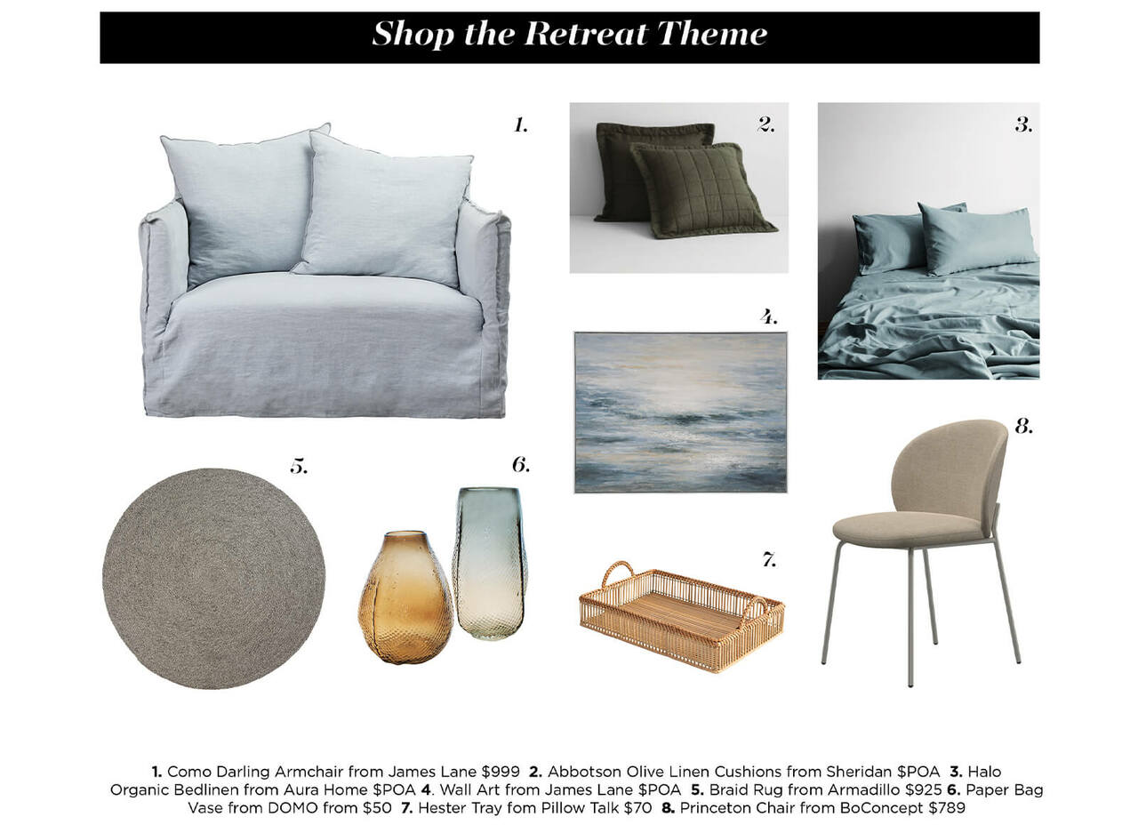
Achieve the Retreat Palette through tactile fabrics and decor items
Style spaces with simple, handcrafted pieces; think displays of rustic ceramics arranged on a mantelpiece or a floating shelf, upcycled planters, vintage accents and tactile, woven textiles in the Retreat colour palette. When it comes to furniture and accessories, seek out pieces in natural, honest materials, such as raw and rustic timber (dark stains look beautiful with this moody palette), leather and natural stone.
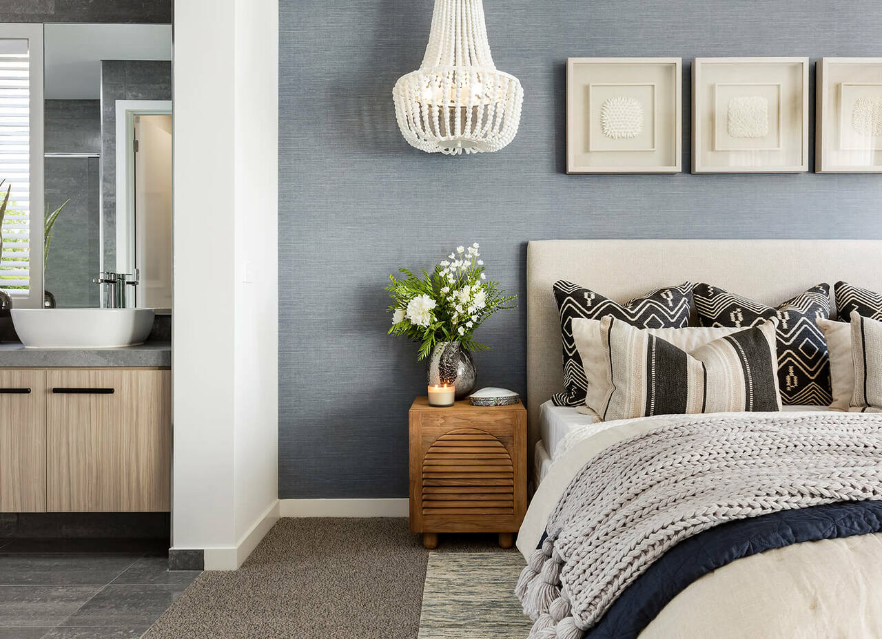
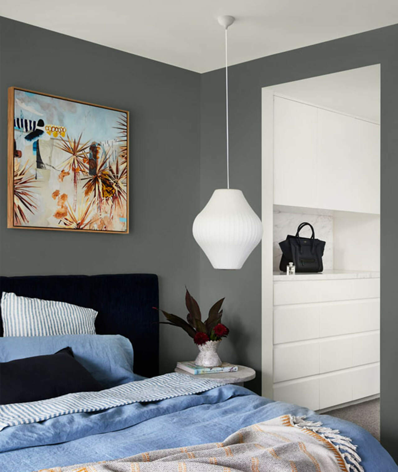
Start your Retreat colour journey in the bedroom by mixing contrasting hues of blue with soft grey and light toned textural furnishings, as pictured in Langholm.
Add an element of surprise
This palette speaks of the increasingly blurred lines between work and home, with unpredictable colour combinations such as burgundy and stormy blue, and verdant mangrove green and dusty blue. Lean into this theme by mixing old and new pieces and ornate and streamlined ones in your room settings to create a look that’s both dynamic and surprising.
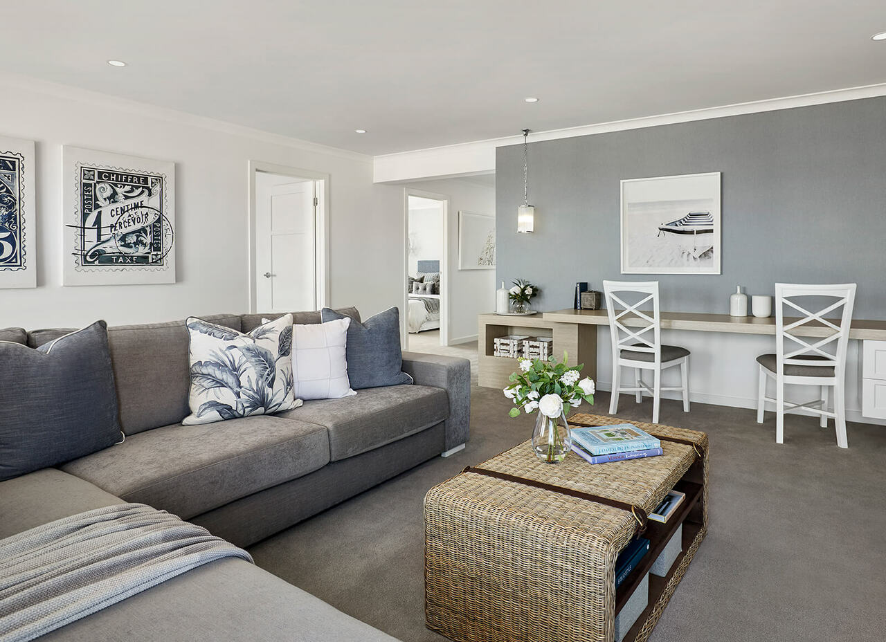
Express yourself through artwork that inspires and evokes peaceful moments, as pictured in Sorrento Grand Retreat.
Choose inspiring artwork
Add depth and interest to your scheme with eye-catching artwork that speaks to you, whether it’s a pair of graphic, contemporary prints at the end of a hallway, a serene landscape in colours that tone in with your walls and furnishings in the dining room, or an oversized, botanical artwork in bold, contrasting hues above the bed.
Explore the deep variations of colour throughout the rooms of your home to create a visual link between spaces, as pictured in Langholm.
Break the rules when you feel like it
While Dulux’s new trend palettes are a great place to start when it comes to selecting colour for your own home, there’s no rule to say you have to stick with a single one, says Lucena-Orr; “Colour is such a personal thing. Don’t be afraid to select colours between the three palettes to create a look that’s all your own.”
Read our first story in this series on Dulux’s new Nourish colour palette here.
Did you find this Home Files blog helpful?
Don't forget to bookmark it so you can revisit it later!